UX lessons learned from everyday products and experiences. These posts are also included in my blog.
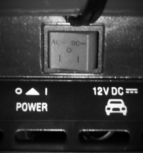
Back of a Black & Decker Air Station. Can be powered from a standard plug (AC) or a car lighter (DC), and you choose which. The design doesn’t assume you know which is AC and which is DC.
Actually, it gives various opportunities to figure out which is which, and when all else fails provides the icon of a car to make it absolutely clear. It’s ensuring understanding and educating at the same time.
Labels are good. Labels that assume the user has a specialized vocabulary are not. For example a button that says ‘Check If This Username is Available’ is much better than a button that says 'Validate The Uniqueness of this ID’.
Be sure your labels do not make unreasonable vocabulary assumptions. Better, teach the user new vocabulary through the interface design.
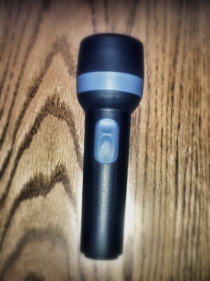
A flashlight is designed to be used in the dark. The simple act of picking it up puts your fingers in the position needed to be able to turn it on. You can turn on a flashlight without having to see.
Actions should be in the most natural positions for their usage. A large form with a save button icon somewhere off in a corner, or an important screen hidden under a four level navigation menu keep the user blind.
The more the user has to hunt, the more likely their frustration, exhaustion, and potential failure.

The doorknob with lock. People on the outside cannot open the door, however turning the doorknob from the inside automatically unlocks it.
Security is important, but that isn’t excuse for software to be laborious. Afford people the ability to both provide their credentials and their intentions.
For example, if they go to a secure area of the software and are forced to log in, after they log in you should automatically take them to wherever they originally wanted to go.

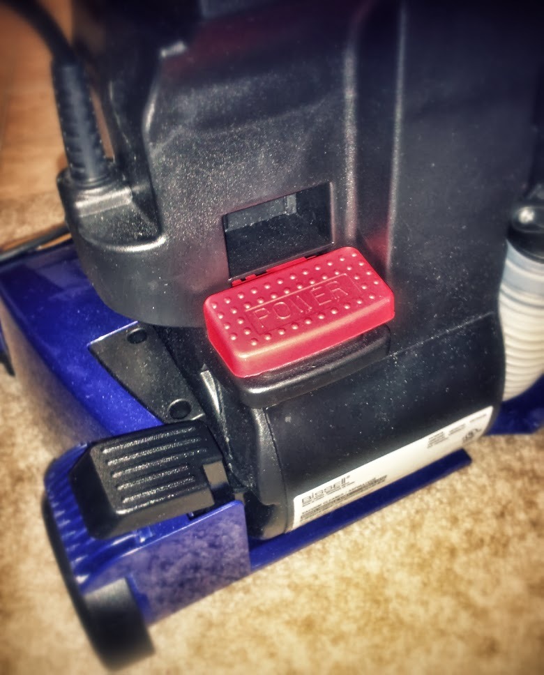
An on/off switch on a desk lamp. A single interface controls both on and off. Since it is the only option, it is obvious by process of elimination. There is also strong and immediate user feedback. “Light off! Light on!” is hard to miss.
Elements of an interface should only perform one function. You can consider a toggle as only “one” function: ‘Off’ is only available when 'On’ and vice versa.
Toggle is less obvious when many interface elements are present, so strong feedback from the action (like 'light on/light off’) becomes even more important.
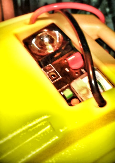
Portable charger for a car battery. Cords are made to wrap around the charger and lock in place. This looks very nice, but the cords are far too short and makes it extremely cumbersome to connect. This only worsens the frustration you are almost always already experiencing whenever you use this device.
Aesthetics are important, but they are not worth sacrificing ease of use. The best designs are both beautiful and clever. Ease of use is even more important when the functionality is explicitly used under stressful situations.

Panel on a Keurig coffee brewer. Turn it on, main screen says ‘Ready to Brew’, and you choose one of 3 cup sizes. There are no labels, but the clarity of icons and reduction of options makes it self-evident.
Normally labels are needed on icons. However (if the icons are extremely clear, agree with the context, and the interface’s goal is self-evident and highly focused) labels aren’t always necessary.
Back of a vacuum cleaner. How do you turn it on? Once you turn it on, how do you tilt it back?
Primary functions should be obvious. Secondary or related functions should be easily accessed alongside the primary action.

Struck by the brilliance of a tissue box. Not so much that you can get a tissue out, but that the next one is left waiting for you.
Most software is a series of tasks. Make the next logical tasks readily available upon completing the current one.
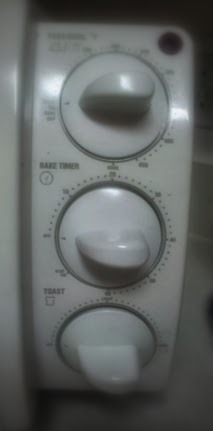
My toaster oven. Top dial when in the ‘off’ position means oven is off, but toaster is on. The bottom two individually control toast versus oven.
Many a time I have left the toaster thinking it was toasting, when it was in oven position, or vice versa. The toaster ticks, but I return to find no heat, no ready food.
In software each interface should DOTW: “Do One Thing Well”. The more functions any element of an interface carries out, the less likely it is do any of them well.
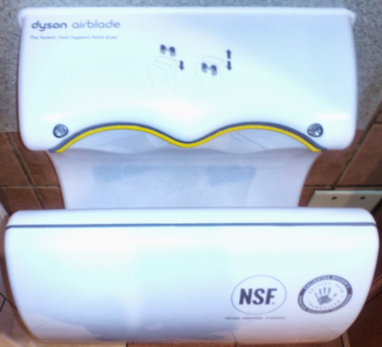
Dyson bathroom hand dryer.
Good: Where do you put your hands?
Bad: Hand spaces are too small. You inevitably touch the sides which ruins the whole point.
Make it easy. But software has to actually do what it says it will do, otherwise all the other good UX doesn’t matter.

Airplane tray table. How do you open it?
Give your user’s best guess the highest probability of being right.
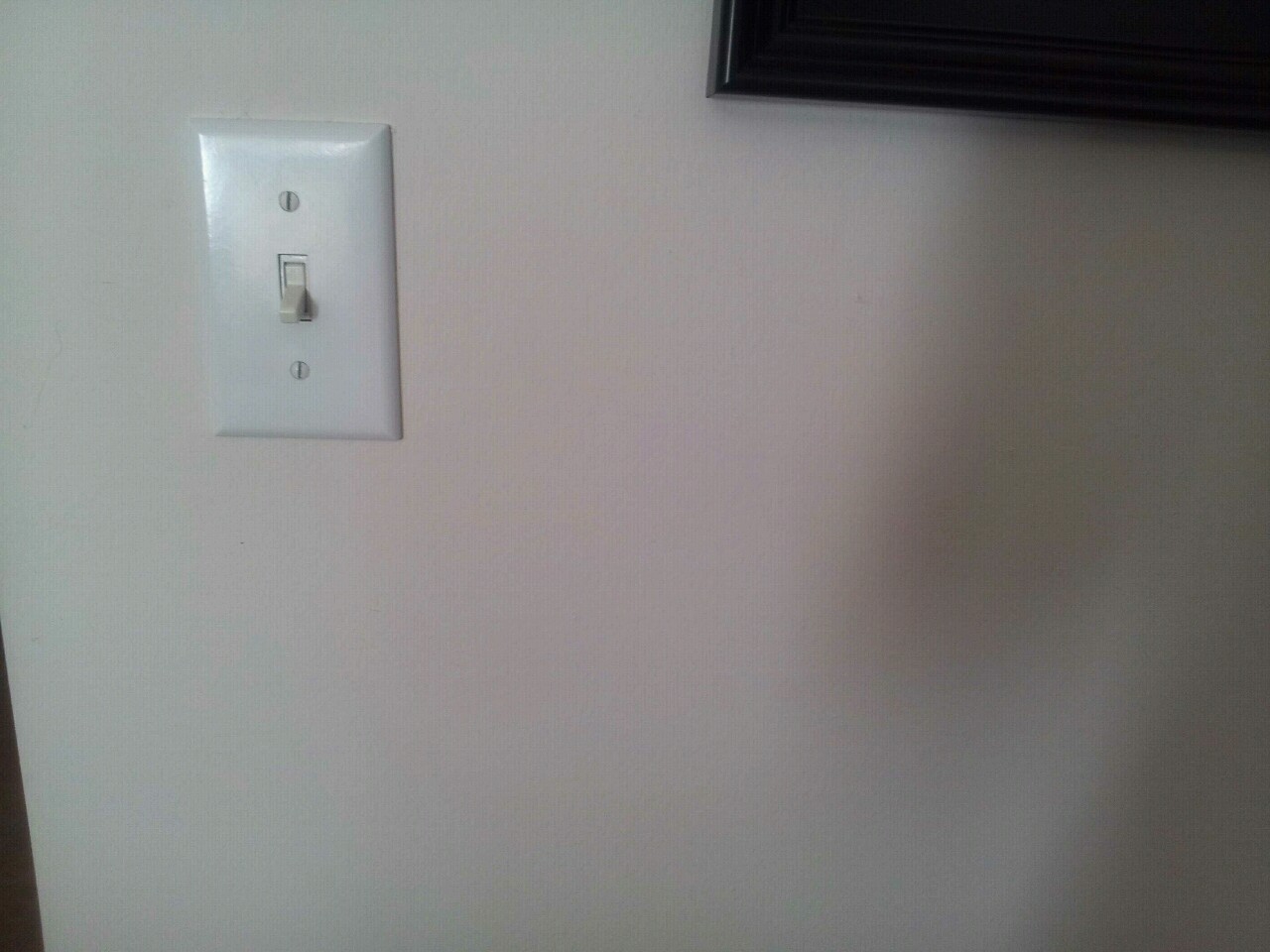
Single light switch on blank wall.
A self-evident interface doesn’t need documentation. Scannable, limited options teach without words.