Good Interface, Bad Interface
UX lessons learned from everyday products and experiences. These posts are also included in my blog.

A wall of wine at a winery in Niagara-on-the-Lake. The undersides of the bottles are curved, which gives the wall of wine a lovely reflective appearance.
However the bottoms are curved, not for appearance sake, but to prevent the pressure from bursting the bottles while they sit in the rack.
The best UX is both beautiful and serves a functional purpose. Analyze your design and remove the beauty that exists only for beauty’s sake. Focus on making functional things beautiful.
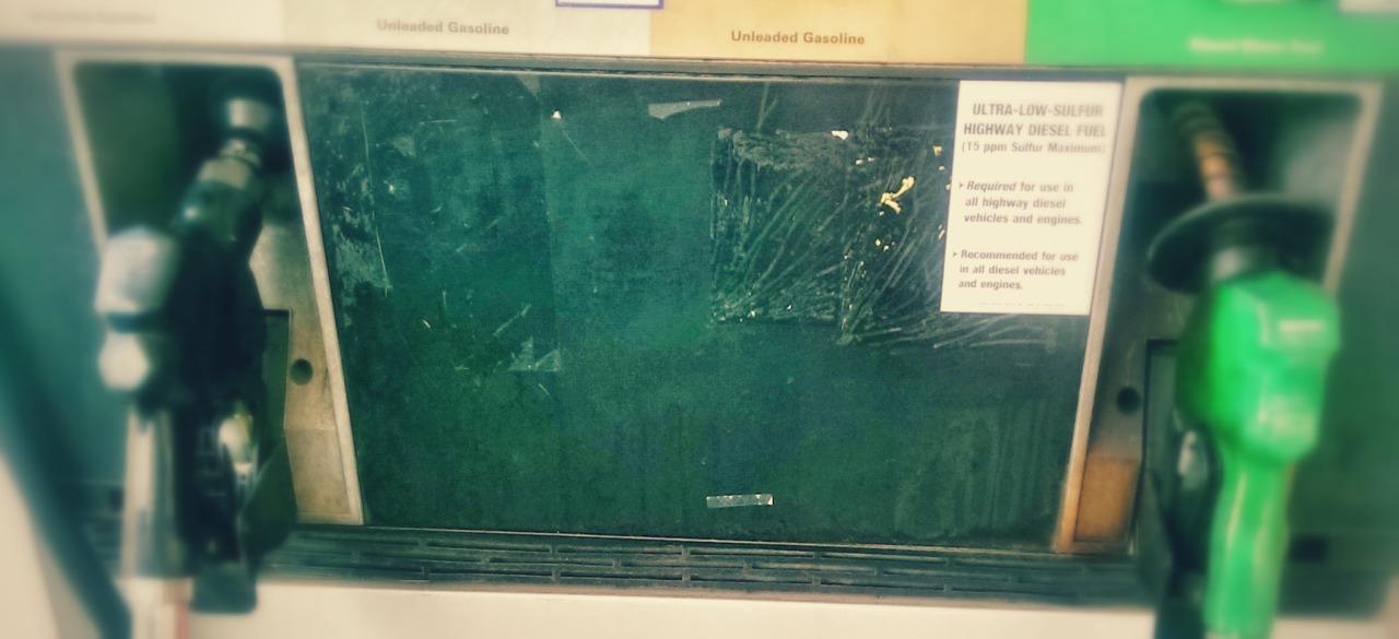
The diesel fuel pump in one state is green, while in another is black. Quite confusing for the traveler.
One may find oneself confused as to why the pump does not fit into your gas tank…however the prevention of error is extremely important in this case.
Consistency and standards are good things. While making something obvious is the best approach to software design, respecting standards prevents confusion against learned behaviors.
At the same time, preventing error is equally vital, especially if the error will cause serious, irreparable problems.
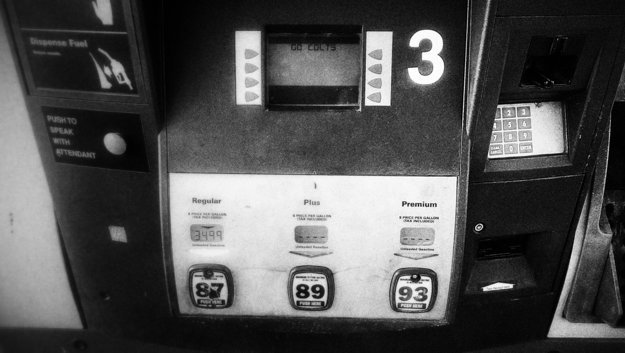
This gas station pump asks for your zip code when you enter your credit card. Then you have to search around for where to enter it. The keypad is set off to the right and inset.
It doesn’t appear to have any relationship to the screen where the message displays, causing a brief moment of confusion as you scan for an interface to obey the screen commands.
Pay attention to gestalt principles. Elements of an interface that are related should appear to be so visually via position, color, size, borders, whitespace, etc.
Make related elements obviously, visually related, and you will cause less moments of confusion, less scanning, and less frustration.

Boarding a Southwest Airlines plane is a study in frustration. There are always at least several people milling about in confusion, most trying to figure out their line-up process while handling bags and children.
The competitive ‘get on the plane first and claim a seat before everyone else’ turns their confused state into potentials for agitation and aggression (getting ahead of others when you shouldn’t, realizing too late you’re further back than you should have been).
Those who are frequent flyers on the airline have a decided advantage over the new ones, and the agitated state of passengers translate into more frazzled employees.
UX isn’t just about ease of use. It’s about avoiding frustration. It’s about how software makes you feel.
Frustrating software results in agitated users. Agitated users means you have failed UX. Agitated users also introduces a host of other problems, such as exaggerated complaints, lack of patience with other minor software issues, and loss of loyalty.
Care about your users. When they walk away from your software, they should feel good. Or at least, no worse than when they started.
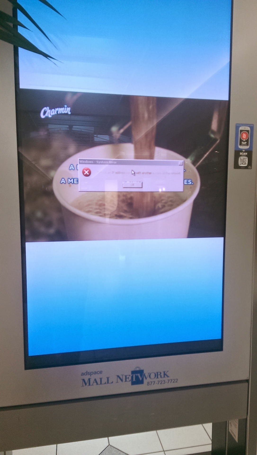
Mall kiosk with a Windows error. Graceful handling of errors is everyone’s job. A poorly handled error can pull the user down into the lower layers of abstraction, destroying the user experience.
Handle errors gracefully, either hiding them, or displaying them as an integrated part of the user experience.
Special integrated error pages or messages go a long way to put the user at ease when an error occurs. It says: “we knew this could happen - don’t panic." This would include user error, coding error, and even OS and network errors where possible.
Assume everything will break - then work up from there.
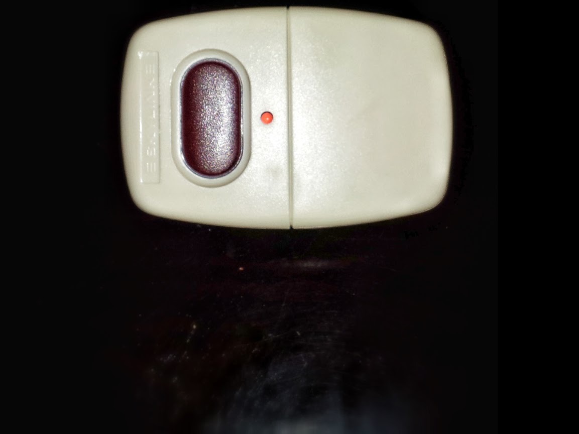
Simple garage door opener. It does one thing well. There is a single button, and an indicator providing feedback. However it is also extremely easy to click the extruded button.
Time and again I find myself accidentally opening or closing the garage (sometimes with myself in it). So much so that I periodically check that the garage door is closed.
Ease of use is incredibly important in software. However certain functions, especially dangerous ones, should not be made easy to accidentally invoke.
For deletions, take a user to a completely separate screen or large modal with clear indications of what is about to happen.
Wherever possible and applicable, provide ‘undo’, and make it immediately available after the action is taken.
Easy-to-use is rewarding. Easy-to-do-accidentally is frustrating. Be sure your designs know the difference.
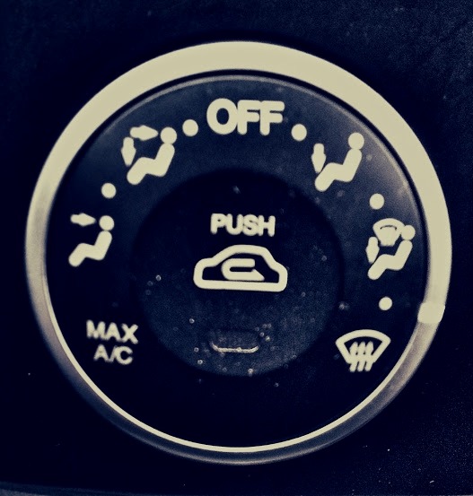
Heating and Cooling controller in an older model Kia. There are 12 positions. Seven are labelled. Five are not.
What in the world is the position between ‘defrost’ and 'feet and defrost’? I have no idea. In fact, I still have no idea. Perhaps the designer ran out of room for icons, but the middle states simply aren’t guessable unless you designed the system.
One of the most common mistakes in UX is failing to realize that your design appears usable to you only because you already understand the system.
What is obvious to you is not necessarily obvious to the user. Don’t let love of a design blind you to its failings. Don’t let yourself get away with 'they can read the manual’, 'they should be smart enough to get this’, or other such self-serving thoughts.
Make it obvious. Make it guessable. Make it good.

The key and lock is one of the oldest and best examples of a good interface. It’s guessable (there’s only one keyhole in the average door), secure (you have to know and have the right key, but it isn’t hard to use), consistent (know how to use one key, you know how to use almost all), and provides good feedback (key turns or it doesn’t).
Above the all the key/lock interface is good abstraction. Few people truly know how the tumblers in a lock work, and fewer still could design them. Yet the key abstracts the user away from the inner workings of the lock, allowing them to focus on the task (opening or locking the door) rather than how the tool helps them accomplish it.
Interfaces that have been around for centuries have done so for a reason, because they rely on UX truths that work no matter what the technology.
Guessability, security, consistency, feedback, and good abstractions are something that every interface (physical, software, or otherwise) should share.
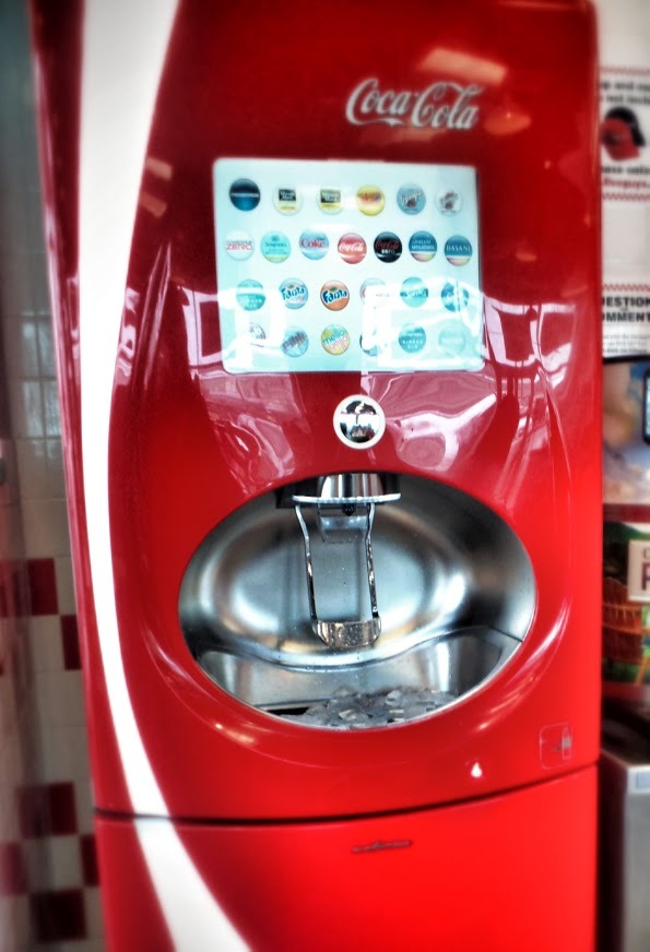
Drink machine at a local Five Guys. I watched as every single person made some form of mistake during use.
There is a touch screen selection UI, and a ‘Push’ button below it. However the button always says 'Push’, so most push it not realizing they’ve made a mistake in the selection process and something unexpected pours out.
The beauty of old-school drink machines is that they’re hard to get wrong. Each lever corresponds to a specific drink, and the only action available per drink is 'make this drink come out’.
Newer or prettier isn’t always better. Using a new interface technology simply for the sake of the new technology is a fail if you don’t follow the basics of good user experience.
In this case the UX principle broken is feedback. Since one button does many things ('Push’ could mean one of any of the drinks), it fails to follow DOTW, thus good feedback is vital.
For example the button could say 'Push for Coke’ when Coke is selected and 'Push for Sprite’ when Sprite is selected, etc. Feedback of this style allows the user to understand the action they are about to take, and allows them to make a correction before the wrong drink spills into their cup.
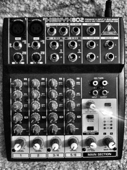
A Behringer 802 Mixer. Mixer boards are powerful and useful, but they must be learned. A mixer board is the opposite of a lightswitch, there is nothing obvious or intuitive about it.
There are so many options the user’s best guess is likely wrong (though labeling helps), and the designer must rely on memorization and education on the user’s part to use the device well.
There is nothing wrong with dashboards, portals, hubs, etc - as long as you don’t expect them to be used by new users. Many options means many ways to get it wrong. If you build an interface this way, you must assume memorization and education, not guessability.
So look at your user base and decide: Am I building a mixer board or a light switch?
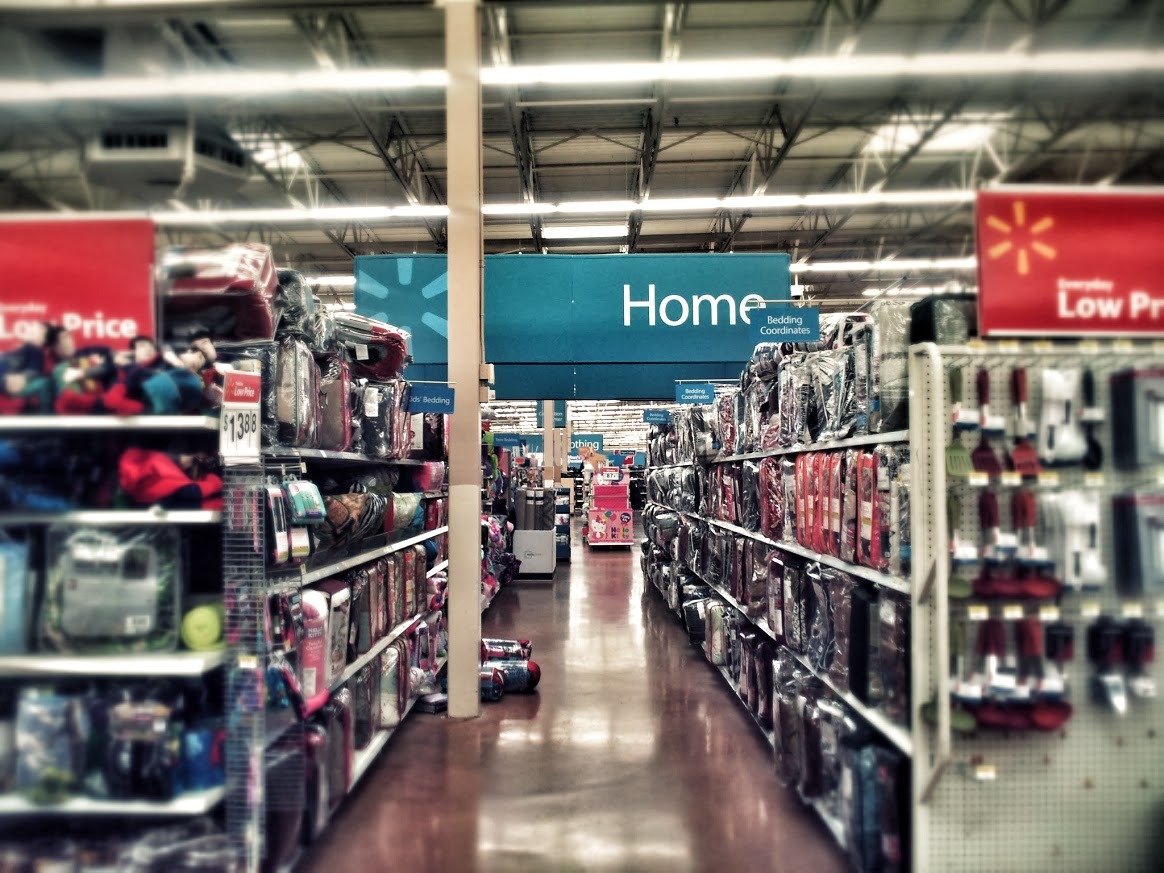
Walmart. Primary sections, sub sections, and sale areas are clearly marked – yet you still have to stumble around to figure out where you are in relation to everything else.
If you were suddenly transported to a spot like this in the middle of a Walmart, would you know how to get to Electronics?
If you watch people’s user experience at a Walmart, there’s a lot of neck craning, searching for signs of where to go.
Better: Subtle markers pointing to other areas visible from any point in the store.
Navigation in your app or site should meet the ‘dropped in the middle of the site from a search engine’ test.
It may be clear where other related pages are, but can your users tell where they are in relation to your entire site?
Don’t make your users crane their necks to find what they’re looking for. They might just give up and leave.

A mechanical pencil follows DOTW (Do One Thing Well). There is only one way to get lead out, and only one option to try. However it breaks down when the lead runs out. How many times have you shaken a pencil to see if lead is still in it?
Better: If, once the lead ran out, a bright red warning piece of plastic came out of the tip clearly indicating the error state.
A simple interface that ‘Does One Thing Well’ is highly desirable and guessable. Yet you must take into account all 3 states of an interface: Empty, Full, and Error.
If you have a clear picture of all three states when you design then so will your users.