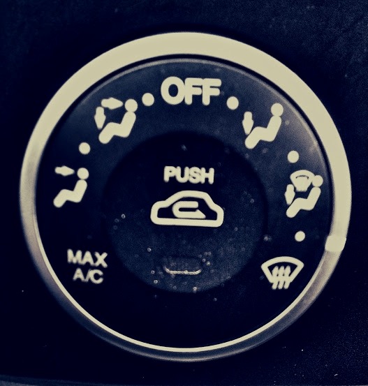
Heating and Cooling controller in an older model Kia. There are 12 positions. Seven are labelled. Five are not.
What in the world is the position between ‘defrost’ and 'feet and defrost’? I have no idea. In fact, I still have no idea. Perhaps the designer ran out of room for icons, but the middle states simply aren’t guessable unless you designed the system.
One of the most common mistakes in UX is failing to realize that your design appears usable to you only because you already understand the system.
What is obvious to you is not necessarily obvious to the user. Don’t let love of a design blind you to its failings. Don’t let yourself get away with 'they can read the manual’, 'they should be smart enough to get this’, or other such self-serving thoughts.
Make it obvious. Make it guessable. Make it good.