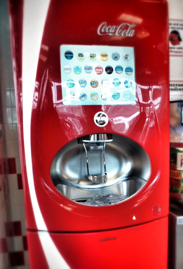
Drink machine at a local Five Guys. I watched as every single person made some form of mistake during use.
There is a touch screen selection UI, and a ‘Push’ button below it. However the button always says 'Push’, so most push it not realizing they’ve made a mistake in the selection process and something unexpected pours out.
The beauty of old-school drink machines is that they’re hard to get wrong. Each lever corresponds to a specific drink, and the only action available per drink is 'make this drink come out’.
Newer or prettier isn’t always better. Using a new interface technology simply for the sake of the new technology is a fail if you don’t follow the basics of good user experience.
In this case the UX principle broken is feedback. Since one button does many things ('Push’ could mean one of any of the drinks), it fails to follow DOTW, thus good feedback is vital.
For example the button could say 'Push for Coke’ when Coke is selected and 'Push for Sprite’ when Sprite is selected, etc. Feedback of this style allows the user to understand the action they are about to take, and allows them to make a correction before the wrong drink spills into their cup.