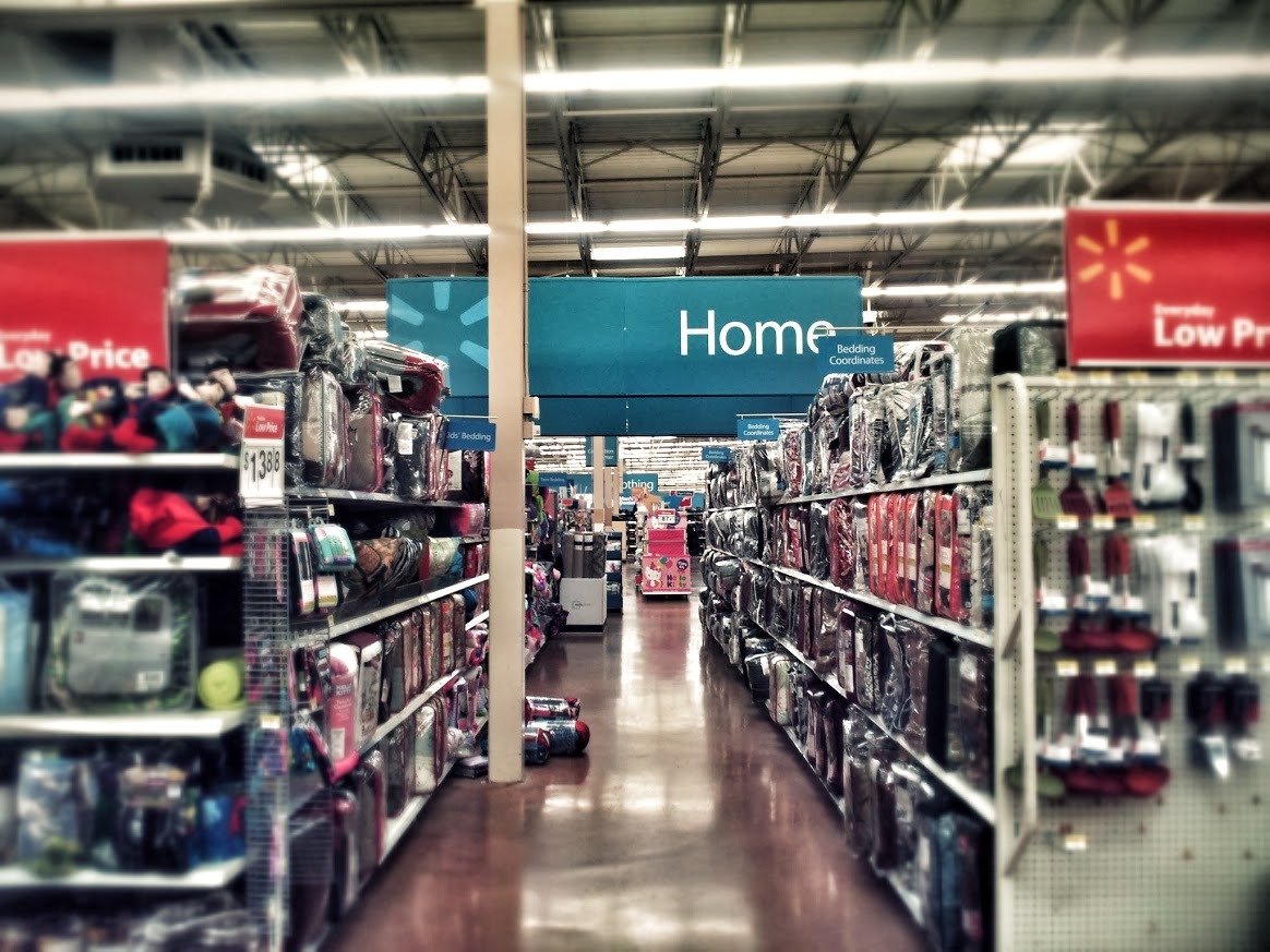
Walmart. Primary sections, sub sections, and sale areas are clearly marked – yet you still have to stumble around to figure out where you are in relation to everything else.
If you were suddenly transported to a spot like this in the middle of a Walmart, would you know how to get to Electronics?
If you watch people’s user experience at a Walmart, there’s a lot of neck craning, searching for signs of where to go.
Better: Subtle markers pointing to other areas visible from any point in the store.
Navigation in your app or site should meet the ‘dropped in the middle of the site from a search engine’ test.
It may be clear where other related pages are, but can your users tell where they are in relation to your entire site?
Don’t make your users crane their necks to find what they’re looking for. They might just give up and leave.