
DOTW: Do One Thing Well
The Mantra of the Guessable Interface
In the land of coding there is a principle that defines the essence of modern multi-tier software architectures. DRY: Don't Repeat Yourself.
DRY has become so widely accepted in software design because the benefits are obvious and immediate. Less code to write, less bugs to fix. It makes for less confusing software from the programmer's perspective, which leads to better software for everyone.
The DRY principle is this: "Every piece of knowledge must have a single, unambiguous, authoritative representation within a system." DRY works for software architecture. It's about reduction.
In my design experience I have found that there is a very similar UX principle that is equally effective in developing usable (that is, guessable) software.
DOTW: Do One Thing Well
The principle is simple. As with all principles, its application varies depending on the circumstances. If I was to try defining DOTW more strictly, I would say:
Any screen or interface should accomplish at most one task.
Trying to do too much makes an interface less guessable - you introduce too many variables, decreasing the probability of the user's next 'how do I do this' guess being the correct one.
Even power users benefit from this principle. We give power users big 'everything at your fingertips' screens because we expect that they want a screen where they can do it all. However multi-focus screens usually require memorization, and no one's memory is perfect. Single-focus interfaces give less room for error. The less opportunity you give a person to make a mistake, the easier they will feel the software is to use.
A screen that does one thing well also reduces the cognitive load of the user. Cognitive load seems to be cumulative as someone uses software, so the more work they have to do to figure each screen out, the more tired and easily frustrated they become.
Just like DRY, a core idea here then is reduction. Software is about accomplishing tasks. Individual screens should be as focused as possible on a particular task, or aspect of a task, so as to reduce the cognitive load required of that particular screen.
This also has the benefit of making screens more self-evident. You can focus a UI design for a particular screen on accomplishing one task particularly well. It also leaves room to breathe for things like inline help, responsive design, and useful empty and error states.
As I've done work as a database designer, this process reminded me of normalizing a database. Normalizing a database means not storing information in more places than necessary. Normalizing an interface means not asking any single screen to do too much.
I gave my own name to this iterative UI reduction process. I call it interface normalization: Reducing a software interface down to individual screens each representing a single task.
In this process you end up with more individual screens. But I find that the software itself becomes far more usable.
I've been working on generic formulaic examples here. However, there are a variety of examples of the benefits of the DOTW principle and interface normalization in the real world of user experience and product design.
Software Example: Google vs Yahoo!
When discussing the software or website they're paying for, the classic example I give to clients is Google and Yahoo!. Why did Google end up being so much more successful than Yahoo? Obviously the major reason was that Google's search algorithm was so much better.
However, as I think back to the days when Yahoo! was a dominant search engine, and Google began gaining steam, I remember another notable difference that was discussed amongst my internet-loving peers. Google felt easier. It felt easier because it was focused.
When you go to a search engine what is the primary task you want to accomplish? Obviously, search for something. You want to focus your entire cognitive process on accomplishing that task: search. In this regard, Google (still to this day) follows DOTW.
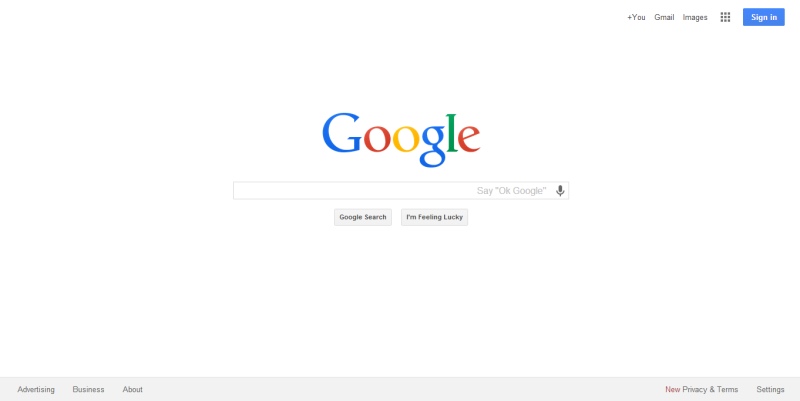
The Google homepage tries to primarily accomplish one thing. Search.The Yahoo! homepage, on the other hand is still stuck in the old 'websites are portals' days. It tries to do a bit of everything on one page.
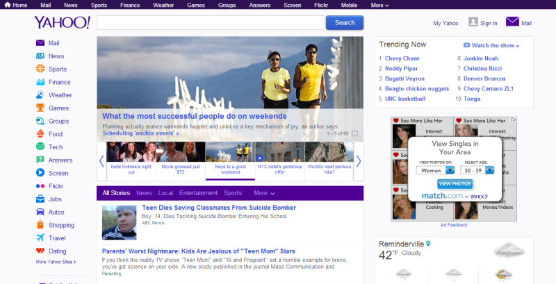
The Yahoo! homepage tries to be many things, and therefore does nothing particularly well.Imagine that you had never used a search engine before. That you'd never seen neither Google nor Yahoo's homepages. Which would you have found more guessable (i.e. usable)? Which would you have figured out faster? Would you assume Yahoo! is searching the whole internet, or just its content?
Google's homepage is minimalistic. However, this does not mean that Google's website has less functionality. Its homepage simply does a far better job of 'doing one thing well', and as Google added features it didn't dilute its homepage's strong sense of purpose.
The funny thing is, Yahoo! followed the opposite track. Take a close look at the slow progression of its homepage over time, from a more strongly focused, opinionated interface, to the 'throw everything on the screen' approach of today: Yahoo's steady home page transformation.
I give this example to clients who are keen on building portal-like software, and they almost always understand it. Often it has saved me from an unnecessarily difficult design situation, and resulted in something the client was ultimately happier with.
Now think about software or other products that you use, have built, or are currently building. Do the interface screens look more like Google or Yahoo? As features are added, which progression do they follow?
Product Example: Toasters vs Toaster Ovens
The DOTW principle doesn't just apply to software. On my everyday UX Tumblr I use a product example that has always frustrated me. Toaster oven design.
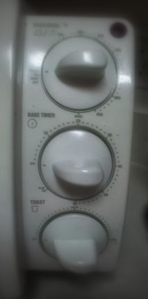
A toaster oven is neither a toaster nor an oven. Nor both. The product designers can't figure out how to deal with that. I have never seen an easy-to-use toaster oven design. Most toaster oven interfaces look like the above. Many dials, many settings, much confusion.
Why are toaster oven controls so often confusing or unclear? Because you are asking the product designer to design for something that does two different things. One dial tries to do multiple things, with no clear feedback. I have burnt more toast than I care to admit.

A toaster follow DOTW. Because it accomplishes only one task, the UI can be optimized for it.Now I've seen plenty of easy-to-use toasters. You set a setting, you pull a lever, you wait. Toast finishing results in audible and physical feedback. A toaster does one thing well.
A toaster oven, on the other hand, is a nightmare of a product design challenge because it doesn't easily allow for a tightly focused interface. One dial often tries to be two things, and feedback can be misleading.
I find it interesting that virtually no manufacturer does a toaster oven interface well. Most just copy each other's flawed designs. It may be laziness. Or it may be that trying to do too many different things in one interface always leads to confusion.
The point is that any interface design benefits from the DOTW principle. The more purposeful your interface, the more self-evident you can make it.
Save Confusion, Not Clicks
From a software perspective, doing one thing well is a design pattern that is contrary to the old assumption that people care the most about reducing the 'number of clicks' you needed to make it through an interface.
In my experience, that is a false metric. What people really care about is, not how many clicks, but the clarity of knowing what to click. Reduce confusion, not clicks. Confusion generates frustration. Make anything less confusing and it will be more popular.
Analyze, Reduce, Retest
The next time you are having difficulty understanding why a design is confusing, ask yourself if it 'does one thing well'. If it follows DOTW. If not, iteratively follow these simple steps:
- Split a single screen into multiple by dividing tasks or elements of a task.
- Adjust the design of each new screen to optimize for that more tightly focused task.
- Retest.
- Repeat.
Split your UI across more self-evident screens, and keep testing. You may not need to go that far before you find considerable improvement in user testing. At the very least, you may find inspiration about different ways to flow your UI.
Remember, most of the time, people are just guessing how to use software. Try making each screen do one thing well, and you may do well yourself.